The Bitwarden Brand
Welcome to the Bitwarden brand guidelines. This document is intended to share the Bitwarden brand strategy, detail core elements of the visual identity, and describe how to protect the Bitwarden brand by designing consistent communications across all media.
Bitwarden promises to deliver reliable, user-friendly, and cutting-edge credential management solutions that empower individuals and organizations to protect their online identities with ease. Bitwarden is committed to prioritizing security, accessibility, and open-source technology while fostering a global community that values transparency, trust, and convenience for a safer and more privacy-conscious digital landscape.

Bitwarden logo
The Bitwarden logo has two approved compositions: horizontal and vertical. When using the Bitwarden logo the primary and preferred composition will be the horizontal lockup. In some cases when the horizontal logo doesn’t work, a vertical lockup can be used for those unique needs.
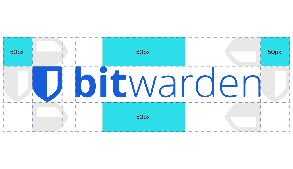
Logo safe area
For both the horizontal and vertical lockups, it’s important that the proper spacing is given to the Bitwarden logo. For the horizontal logo, use one Bitwarden shield width to measure out the logo’s proper spacing. For the vertical logo, use the “X” height of the “Bitwarden” logotype to measure out the logo’s proper spacing.

Product logo lockups
The products under the Bitwarden umbrella are branded with their own logo lockups. These logos are used only when creating content specifically for that product. All other brand styles (colors, type, etc.) stay the same.
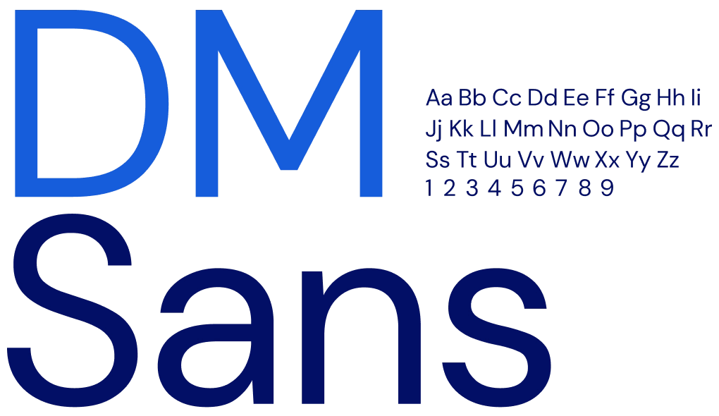
Brand typeface
DM Sans is a friendly and characterized typeface that's usage is less saturated on the web. Its circular bowls give the text an approachable nature and tie nicely into the rounded identity system proposed for Bitwarden. DM Sans, an Open Source Google font, is a low-contrast geometric san serif typeface with a large family of weights. It’s intended for use at smaller text sizes, but also looks amazing on larger scales.
Bitwarden Blue is the brand’s recognizable and ownable color that unifies communications and gives the brand a strong identity.
HEX #175DDC | RGB 23 93 220 | CMYK 86% 84% 0% 0%
The secondary Light Grey color should be used to support Bitwarden Blue as much as possible. This gives Bitwarden Blue room to breathe and leads to a more purposeful usage of colors.
HEX #F3F6F9 | RGB 243 246 249 | CMYK 3% 2% 2% 0%
Deep Blue is to be used as a between color from Bitwarden Blue and Indigo Blue. It should only be used in gradients and illustration elements.
HEX #1A41AC | RGB 26 65 172 | CMYK 95% 82% 0% 0%
The darker Indigo Blue is used for text colors, dark backgrounds, and assets that need more contrast.
HEX #020F66 | RGB 2 15 102 | CMYK 100% 97% 23% 27%
Highlight Teal Blue works as a highlight color to draw viewers’ attention to certain information or illustrations.
HEX #2CDDE9 | RGB 44 221 233 | CMYK 0% 71% 18% 0%
Tertiary colors are only to be used sparingly and when used should be thought out deliberately.
Amber Orange: HEX #FFBF00 | RGB 255 191 0 | CMYK 0% 27% 100% 0%
Melon Red: HEX #FF4E63 | RGB 255 78 99 | CMYK 0% 84% 50% 0%
Medium Purple: HEX #976FD9 | RGB 151 111 217 | CMYK 50% 62% 0% 0%

Radius
The rounded radius is one of the large frameworks for the brand foundation. It ties communications together in one unified visual identity and is built based on the rounded corners of the Bitwarden logomark and the shapes from the brand typeface.
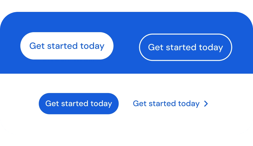
Buttons
The only assets that fall outside of this 36px radius system are buttons. To achieve a pill shape, buttons would use a 50% corner radius of the height of the button. The radius is half of the diameter. For example, a 50px high button has a corner radius of 25px.
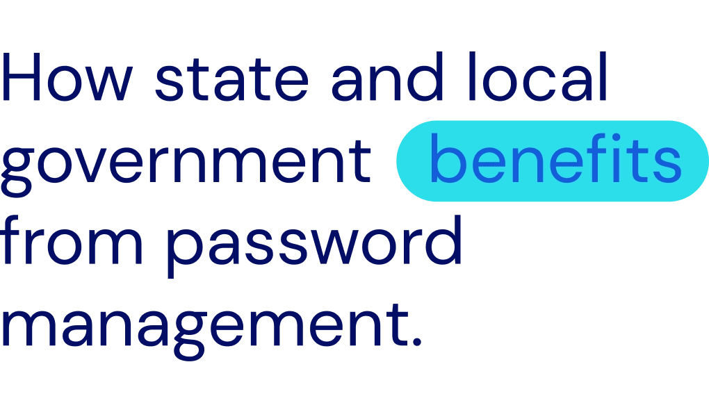
Highlights
This system allows Bitwarden to create a unique branded visual element while also creating a way to highlight important keywords within a statement or headline. The highlight system should only be used for one or two-word highlights. Highlighting a single word should be used on words that summarize or streamline the reader’s understanding of the communication. Highlighting two words should be used in the same use case, but only when an adjective or adverb is needed to properly communicate the highlight.
Iconography
The Bitwarden web icons differ from the product icons in that they are made for larger uses, have more detail, and can be multi-color. These icons use a 2:1 stroke ratio. The bold stroke is used to define the icon, the thin stroke is used to add detail. These icons can be used in monotone or in full color. Solid color background for circles, squares, and other shapes that require definition or contrast can be used as well.
Product
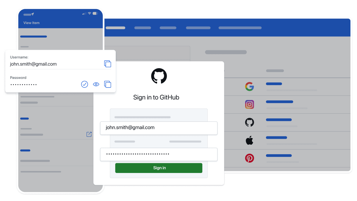
The product is displayed without device wrappers, and instead use a white border to contain the product. Depending on the use case, a high fidelity version of the product may be used, or a more stylized version with unnecessary/filler content reduced down to basic shapes.
For more specific use cases, the product is dimmed in the background and the focus area is enlarged to more clearly show details of a feature or section.
If you would like additional product images, please contact: press@bitwarden.com.

Social posts
Built to 1200x675px for Twitter, the framing creates a united system for the Bitwarden social media posts. The framing system works as seen here:
Bitwarden Blue background cards work with Bitwarden Light Grey border
Bitwarden Light Grey background cards work with Bitwarden Blue border
Bitwarden Indigo Blue background cards work best with Bitwarden Blue border
Bitwarden B-roll
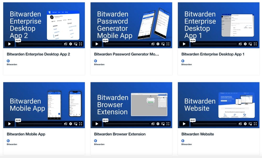
The Bitwarden b-roll is available for public use and distribution. This supplemental footage can be used to showcase the Bitwarden products in reviews, media features, and other news coverage. This b-roll selection includes live-action shots of the product, as well as users navigating the website and the Bitwarden Password Manager across various clients.